PLANET ART REVIEW — BLUE SKY EXHIBIT AT ROCKWELL MUSEUM: 3D DIGITAL AGE MEETS VIRTUOSO ARTISTIC VISIONS
By DAN VALENTI
PLANET VALENTI Arts
(FORTRESS OF SOLITUDE, JUNE 11, 2011) — “But is it art”?
This question has nagged, haunted, and harassed animators and commercial artists since doodlers began finding paying customers in the commercial world. From advertising slicks to lurid pulp magazine covers, illustration has ruffled the bow-tied high brows who wouldn’t dare admit to liking a Norman Rockwell painting. These acolytes of, ahem, “Art” are typically so out of touch with popular culture that they not only think Commander Whitehead is still the pitchman for Schweppes Tonic but, upon finding he is not, would like him to be.
Curiously refreshing.
BLUE SKY BRINGS UP SUMMER AT THE ROCKWELL
Fitting, then, that the animation work of Blue Sky Studios should be featured this late spring and summer at the Norman Rockwell Museum in Stockbridge, Mass., where last night the show opened in a VIP preview. The general public can see “Ice Age to the Digital Age: The Animation Art of Blue Sky Studios” beginning now through Oct. 31.
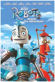
 Blue Sky is the animation company behind such films as Ice Age: Dawn of the Dinosaurs, Horton Hears a Who, Ice Age: The Meltdown, Robots, Ice Age: Licensed to Chill, and a number of short films. The Greenwich, N.Y., based studio started out as an advertising agency, went into special effects, became the poor man’s Pixar, and now sits atop the result created by a revolution in animation technology caused by computers.
The Rockwell Blue Sky collaboration allows an engaging, behind-the scenes, interactive look at how the process of digital 3D animation occurs from conception to fannies watching films in movie houses. According to Laurie Norton Moffatt, Rockwell Museum executive director, the exhibit marks only the second time that animation has been featured in an American art museum. The first was the Pixar show at the Museum of Modern Art in New York City.
Blue Sky, a subsidiary of 20th-Century Fox founded in 1987, has made its speciality one Rockwell would have well appreciated: photo-realism.
Peter de Seve, Blue Sky’s lead designer, led guests through the exhibits. We see every from the first rough sketches (“I’m a believer in doodling” — de Seve) through to the finished product. Storyboards, clay models, props, sketches, and interactive workstations lead the visitor through a reasonable facsimile of the animation process. The presentation within the gallery space is whimsical enough to suit its subject yet buttoned down enough to hand out in high-end gallery space with uniformed guards.
DOODLING: YOU CAN’T DIGITIZE HUMAN CREATIVITY
The “Art” of 3D animation, if it is to be found in the Blue Sky exhibit, occurs in the doodling, roughs, sketches, and drawings from which 3D models are then created to be digitized and brought to life inside cyberspace. There’s no proprietary software package that can take someone like de Seve and instantly make him the best. de Seve graduated in 1980 from the Parsons School of Design then found work in his field, illustrating for magazines and books (he will still do occasional New Yorker covers).
When an artist such as de Seve taps into his inherent talent, develops it through training and pratice, then marries his gift with digitizers, you can say he’s legit. You can’t say that for too many poseurs who can’t draw a straight line with a ruler but, because they can out-geek you, come up with something on a computer that fudges “art.”
There can be no question that the production drawings that make possible these 3D animation marvels qualifies as art, which we can define as an expression of human creativity at its finest levels that produces renditions of conceptual reality primarily for their aesthetic or rhetorical qualities.
 Art isn’t “practical.” When my car gets low on oil, I don’t wan’t a Rembrandt. I want some Havoline. In America, which has turned its artists in to freaks (a nod to Theodore Roethke), we tend to dishonor anything that doesn’t have an overt and immediately apparent function. Add technology, which has suddenly put pseudo-artistic capabilities through computers into the hands of those who have no training or artistic sensibility, and you can see the car wreck.
Today, you don’t need to be a musician to “play” music. You don’t need to be an illustrator to “draw.” There are even programs that will devise plots for writers. Seven-year-olds are doing Power Point presentations for Show and Tell. So what? It doesn’t make them geniuses, contrary to what some breathless parents want you to believe. Consequently, you have what masquerades as “art” committing arts Unpardonable Sin: It’s boring.
If we can put forth one accessible, least common denominator that can nominate Blue Sky’s work as “Art,” let it be that it does not bore. Rather, it engages, stimulates, and make is laugh.
WORKING FROM SCRATCH
No machine can program a human at the artistic level, and that’s the shining grace at the “Ice Age to Digital Age” exhibit at the Rockwell. As much as we can get distracted by the interactive consoles that allow visitors to play with the technology, we keep going back to the hand-done art. The lines are human in a way the most sophisticated 3D animated feature cannot be. We say this with enormous respect for the five years of work that goes into creating a full-length animated feature from, literally, scratch — sketches on scratch pads.
Peter de Seve refers to these drawings as “touchstones” for animators, riggers, and other Blue Sky technicians down the line, whose job it is to bring the characters to digital life. It’s a rigorous process, indeed, computers or not. From the art, which is based on a script (yes!! It all begins with the writer!!), models are created, which allow digital animators to determine the spatial relationships necessary to create believable 3D. The modelers, in fact, are responsible for each 3D shape you see in every movie. Their 3D scans of physical models become the armature and templates for the 3D animations.
We must now divert into a topic that’s not only related but almost in a stifling way: The Third Dimension.
SECOND GUESSING THE THRID DIMENSION
 Animation has long fascinated this reviewer. As a boy, I use to make tiny, animated movies at the bottom of scratch pads, a non-enduring passion I developed after watching a film on Disney animation. I loved the tiny, incremental differences on individual drawings that, when placed upon each other and projected at 24 frames a second, accumulated into motion and movement.
One day, my father came into a vast number of “Jot-It-Down” notepads given out by an accounting firm as a promotional product. A family member worked for the company in Derby, Conn., and he had a full box of pads left over. We took them, to my doodling delight.
I “went Disney” with my Jot-It-Down pads, experimenting with little stick figures drawn on the bottom, one sheet upon the next. When I flipped the pages with my hands, my animated “films” came to life: football kickoffs, gun battles, dancing hot dogs, and letters that did the cha-cha.
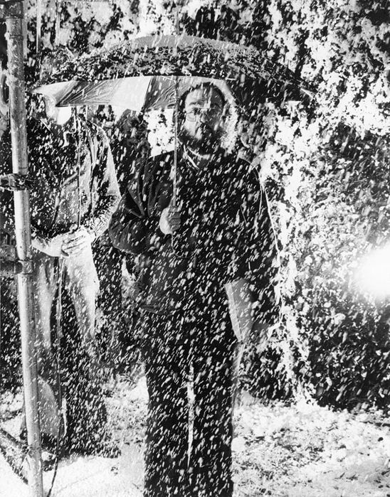
My fascination drove me to film. When I was 16, I commandeered my dad’s Revere 8mm camera and began making genuine movies. Blessedly, the Revere had a single-frame shutter. It sent me on my way to film and animation, a combination of Walter Lantz and Stanley Kubrick (I found live action more compelling and less laborious). A few of my animated shorts still exist.
Flashing forward in a prodigious jump cut, and we arrive at 3D animation and today’s advanced technology that has made of animation’s frontier as familiar as a stroll in the park. As we said earlier, computerized animation shares one great downfall with all other high-tech software designed for the creative arts: It puts sophisticated artistic capabilities into the hands of those who, while sufficiently geeky to command the tech part, are not artists, even though they may wear goutees. Think of the abundance of mediocre music, film, and animation presently extant on the web.
When technical savvy can make a home for artistic merit, you have a good thing. When it builds a safe harbor for great artistic merit, you have the work of Peter de Seves at Blue Sky Studios.
WHY DO I HAVE TO WEAR THOSE HEADACHY RED-AND-BLUE LENSES?
The third dimension has a mottled history in film and on the printed page. Those old enough to remember can recall 3D movie-house headaches sprung from weird glasses, polarized filters, and projection systems not quite in synch. Often, 3D storylines led to awkwardness. If a knife was thrown, it was right at the camera. If a lion attacked, it attacked head on in a beeline. The 3D camera of celluloid film required that action pursue the shortest distance between two points, a straight line from action to lens. Film 3D had us leaving the theater thinking we had seen one dimension too many.
In fact, primitive 3D systems actually seemed to flatten the artistic product. Regular action — dialogue, stationary scenery, the mundane that forms much artistic material — didn’t translate well to the third dimension, which too often became a vacuum cleaner that sucked up one’s willing suspension of disbelief. For example, I once received a Roy Rogers 3D comic book as a kid. When I looked at the page without the special red-blue glasses, the outlines were blurry. When I put the glasses on, the color went crazy and the portion of the drawings that wanted to lift themselves off the page didn’t to an offsetting degree. No amount of red-blue filtering helped.
WILLING TRADEOFFS, BELIEVABLE 3D
Here’s the reality of simulated 3D: The technology is one of tradeoffs. To create the weak illusion of drawings of pictures moving off the page, too many more artistic elements had to be sacrificed. In films, I can think of everything from the dreadful Robot Monster to the more ambitious and accomplished House of Wax. Unlike the 3D of actual life, simulated 3D seemed oddly boring, the technical hurdles making it next-to-impossible for viewers to sustain the illusion.
Most of that (not all) seems finally to have been solved. Blue Sky’s characters and sets have absorbed these lessons and profited greatly. They move in 360-degree freedom, a result likely from the studio’s confidence in using the extra dimension not as a gimmick but as an integral aspect of the work. The sophistication of the technology provides a suitable match for the virtuoso artistic visions of a man like de Seve. His drawings bear the author’s signature. De Seve manages to stamp his imprimatur on every frame. His sketches are identifiable, not anonymous, even after the digitizers bring them to life. They bear his artistic fingerprints — similar to others at a distance but utterly unique in close-up.
At the Rockwell this summer, the process of 3D animation comes alive through the studio that out Pixar-ed Pixar. Take the family and grad some Blue Sky.










Thanks for this review. I agree with your point about the dumbing down capabilities of putting too much technology into too many inept hands but the Blue Sky animators especially Peter de wed high tech with high artistic ability. Great show it seems. We plan on going.
I was honestly amazed with how well this blog was done, beautiful layout, professional writing, great job! 🙂
Interesting article and fun to read. Keep on showing the different perspectives of the other parts of the Berkshire culture.
Enjoyed this review, especially the wonderfully satiric “what for” the writer gives to the snooty Art high brows. The Commander Whitehead/Schweppes reference brought an out-loud laugh. Based on this review, I will be recommending this to my daughter and her family.
Great review! This is exactly the type of article that needs to be shared around the internet. Shame on the search engines for not positioning this article higher!